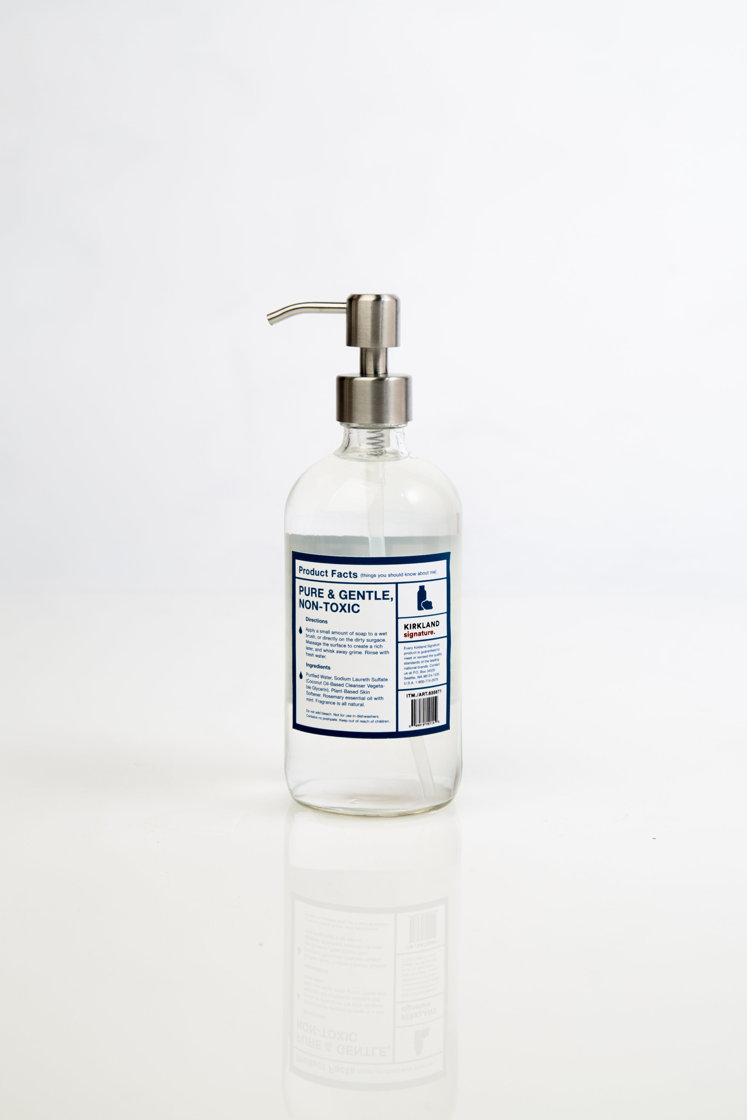
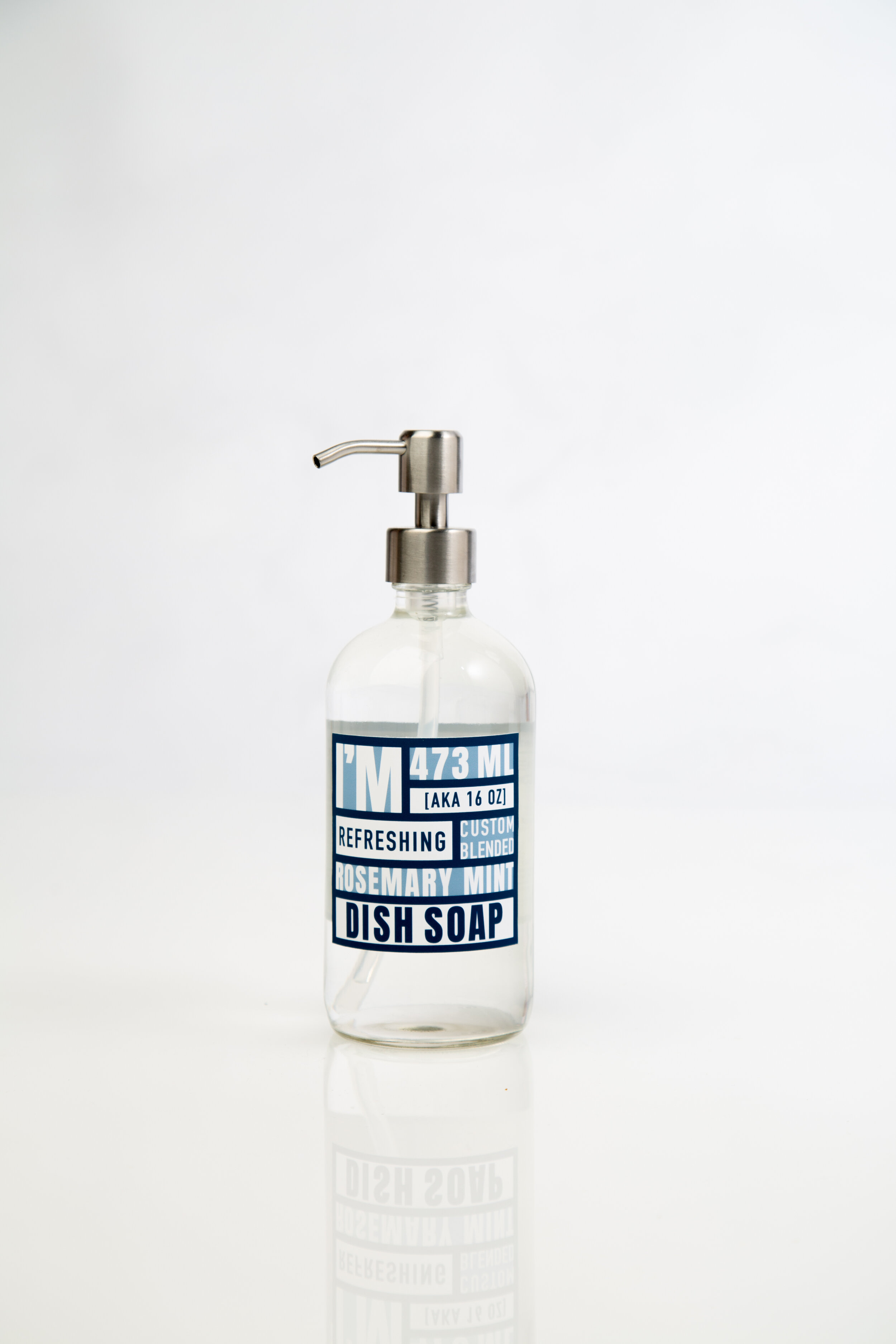
KIRKLAND SIGNATURE
Making the mundane adult errand of grocery shopping more appealing and delightful.
-
Redesign the packaging of an existing signature brand. Conceptualize a new brand and a new visual systematic approach.
-
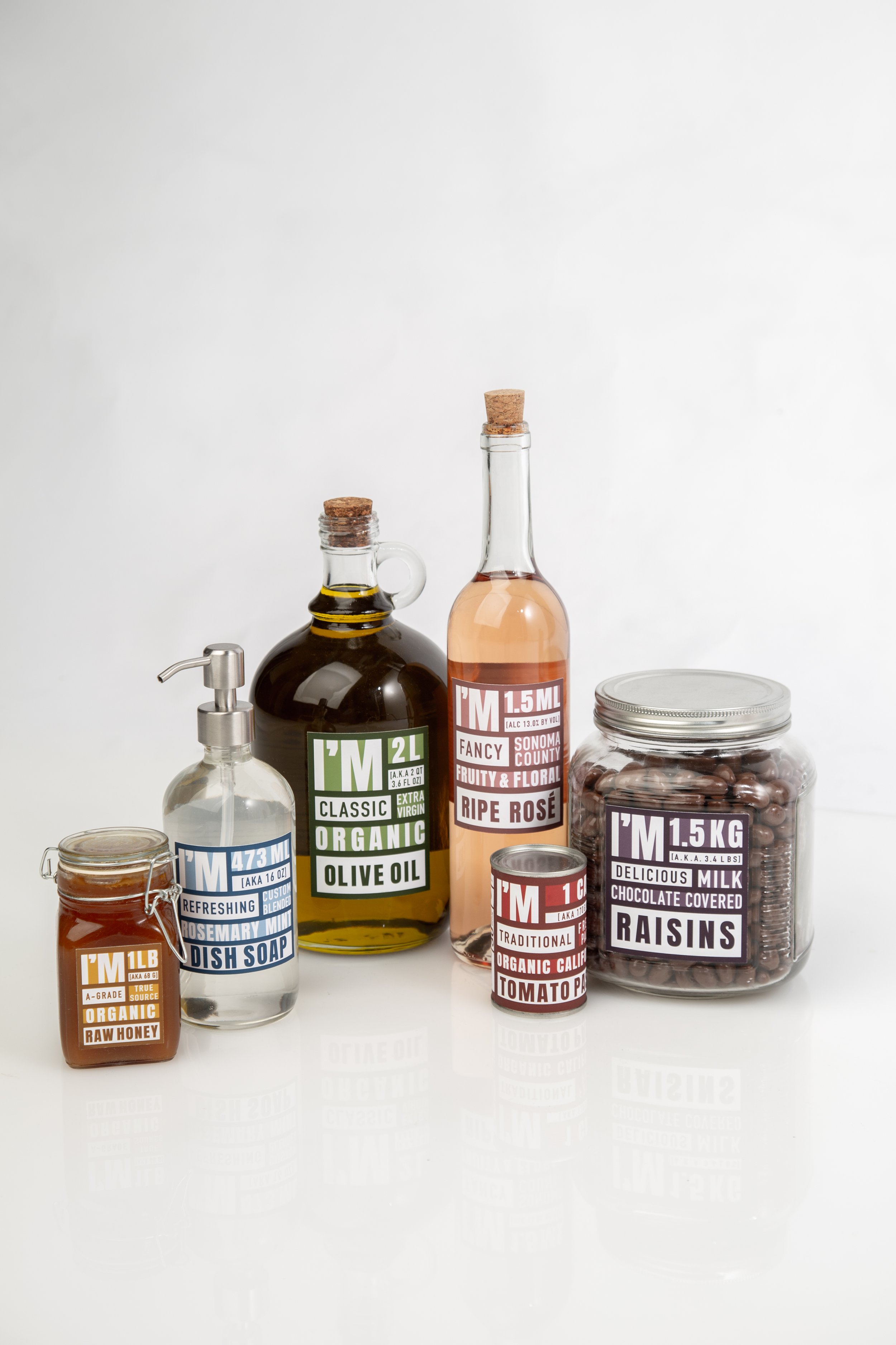
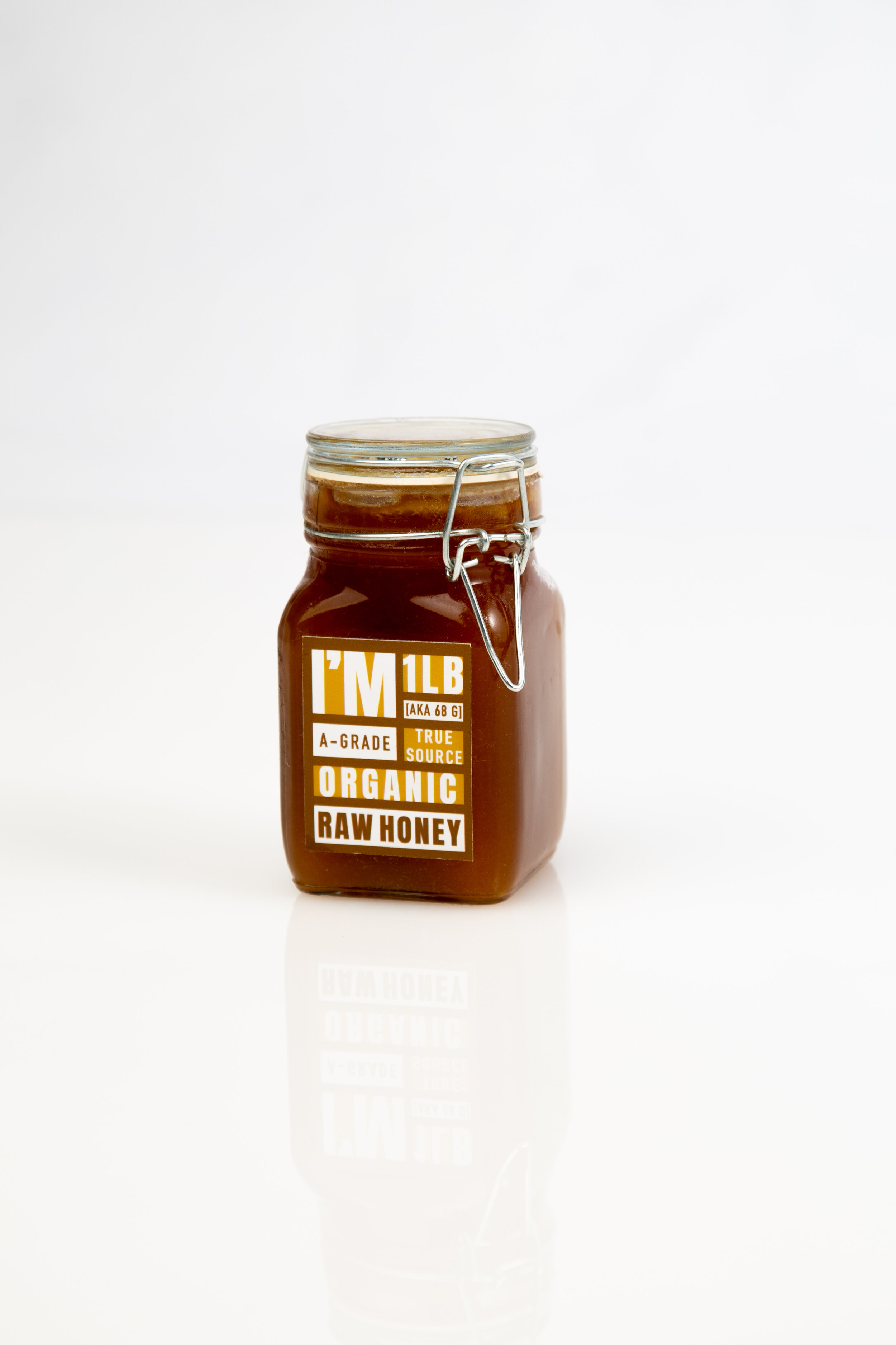
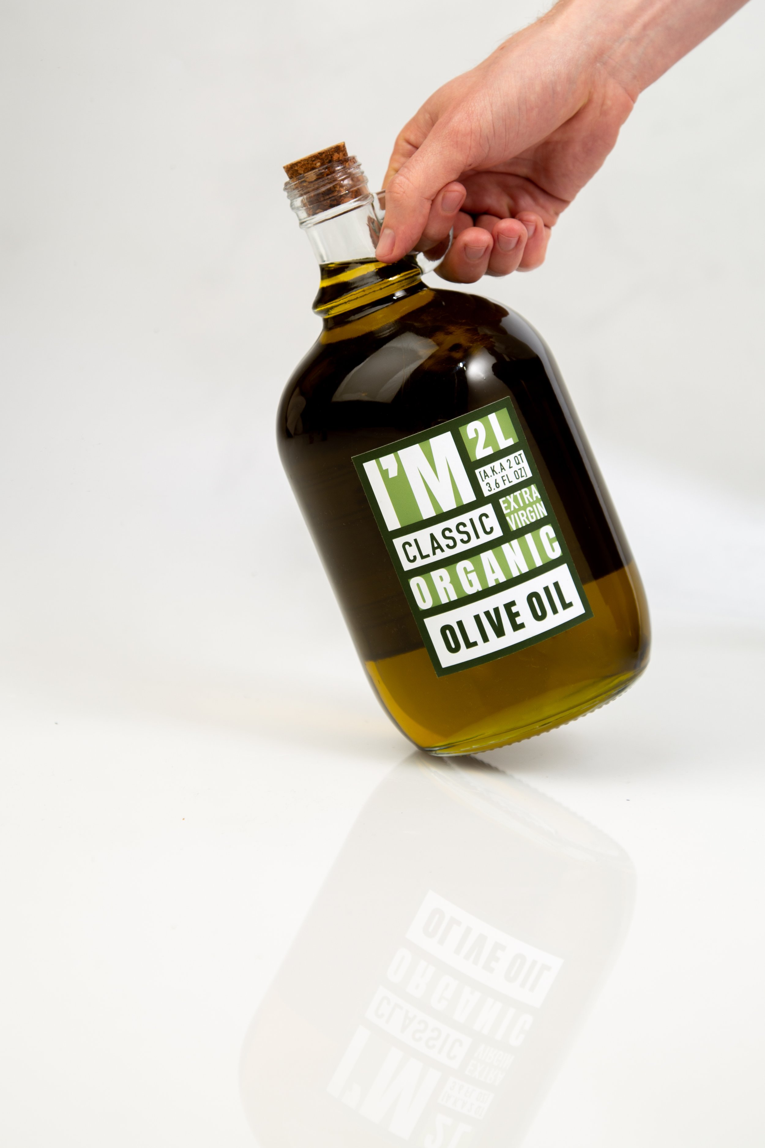
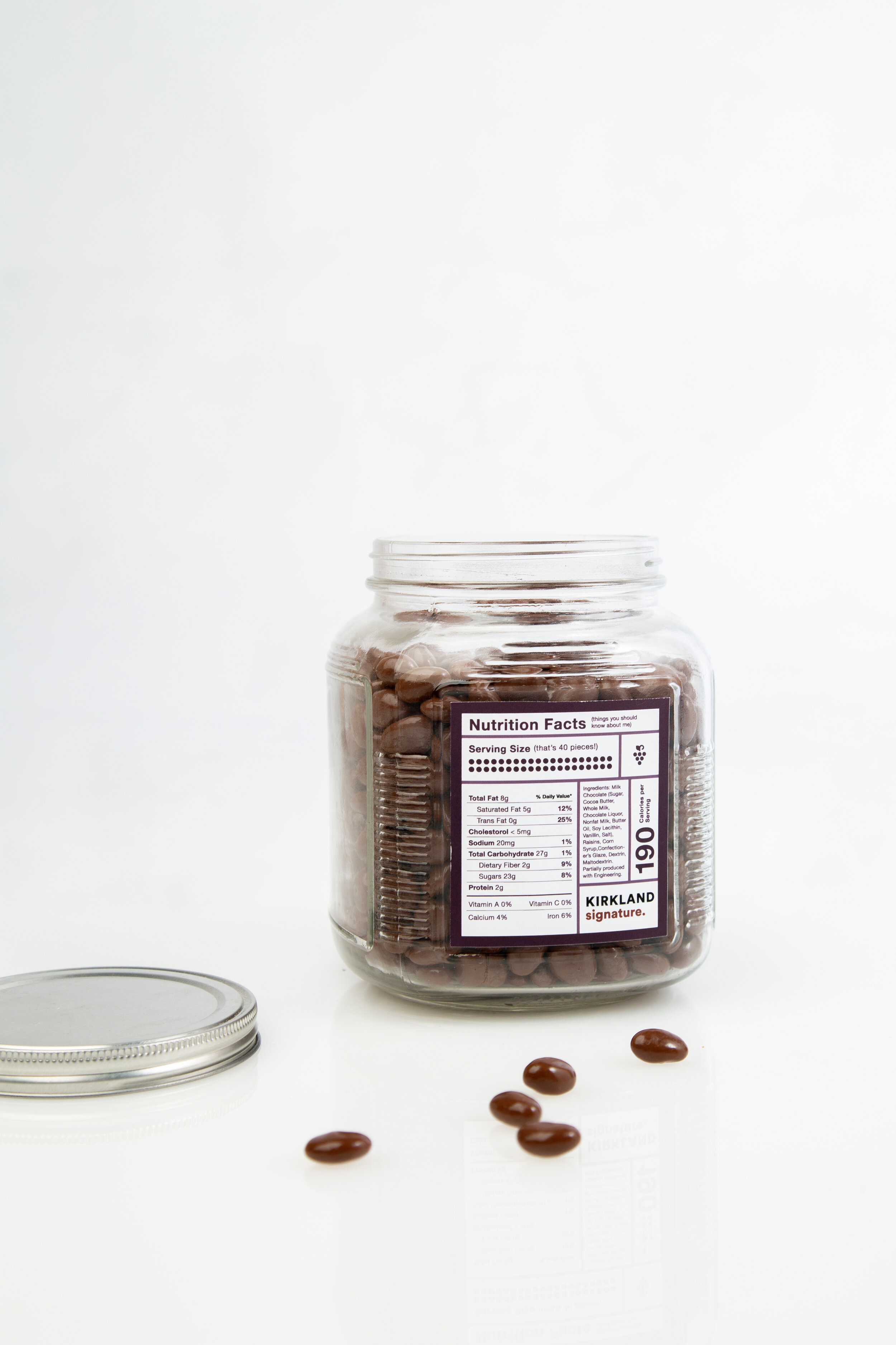
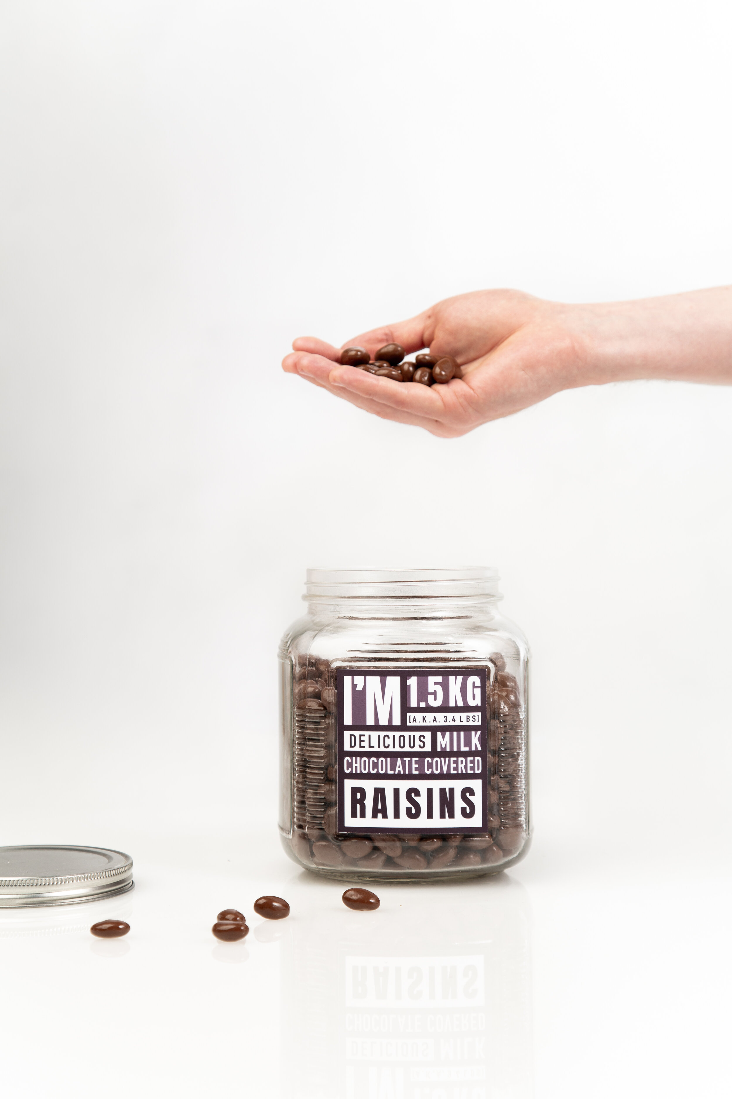
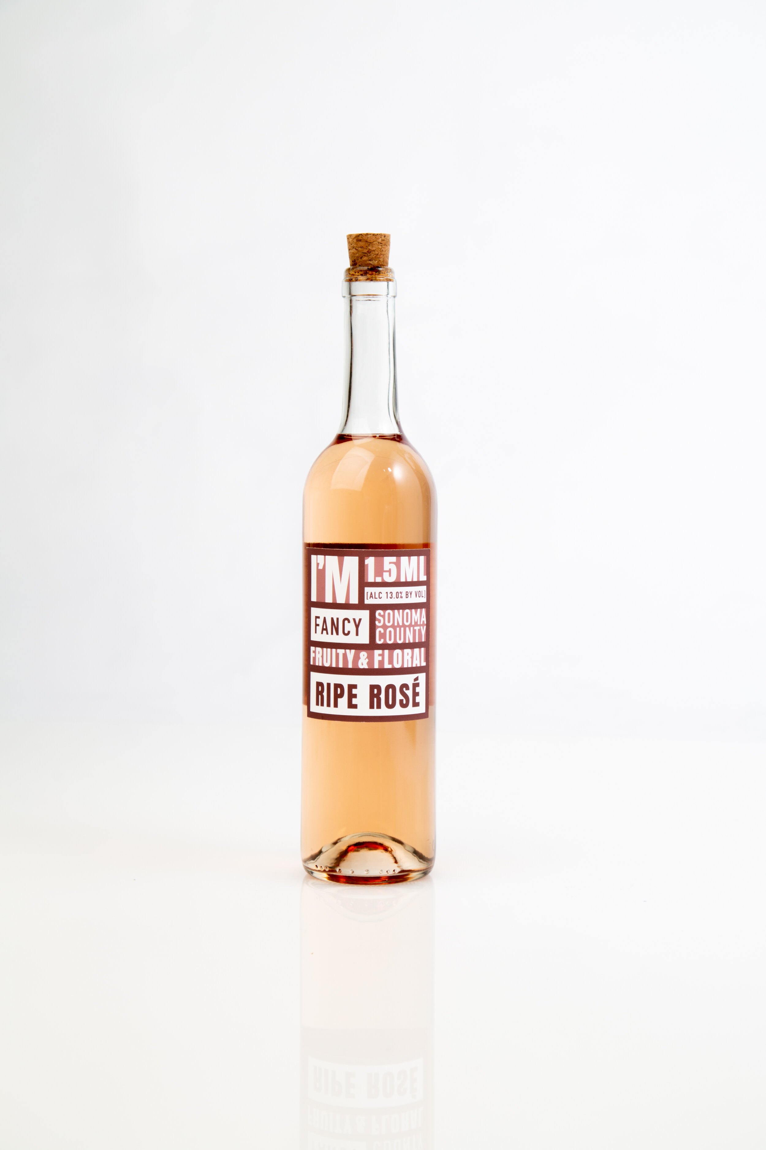
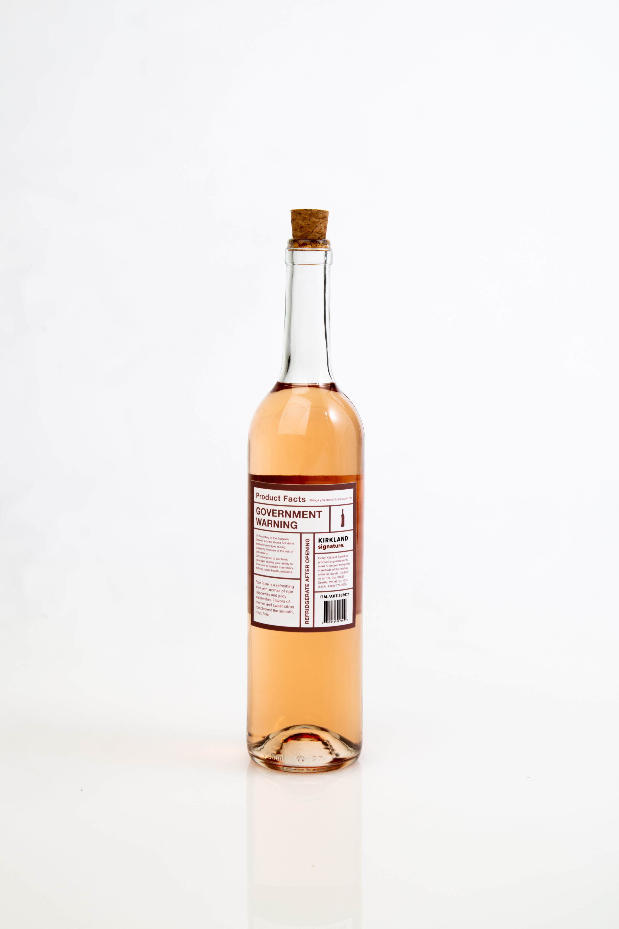
Make Costco’s signature brand, Kirkland Signature appeal to millennials who are journeying into adulthood by personifying each item and giving the brand a likable personality. Create packaging that quite literally speaks for itself and makes the brand more accessible and less intimidating for those who are looking into stocking up their new home.

Reflection
When in the ideation phase of this project, I was trying to figure out the best way to accomplish the "self-explanatory" yet "reliable" adjectives that I set as goals for myself in the redesign. I was quite nervous as my packaging did not include lots of other visuals such as photography, high-fidelity graphics, and so on as compared to my peers. However, I learned that when comparing my work to others, it is important to remember that although we are working on the same project, each of our design problems are distinct and therefore require different design approaches.
Key Takeaway
There is no reason to feel insecure about design that was made with purpose and effective reasoning. As long as I make decisions towards achieving my design goal or solving my design problem, it will all come together in the final product.