Wish Local Landing Page Redesign
An intuitive landing page with the goal of merchant acquisition for Wish Local.
Duration 8 weeks
Role Lead Product Designer
Tools Figma, Miro, Usertesting.com
Outcome Fully shipped redesign of desktop and web page
Introduction This project served as my capstone deliverable for my internship as a Growth Designer at Wish in the winter of 2021. As a Growth Designer/Brand and Marketing Designer, redesigning a website wasn’t exactly what my intern manager Simon had in mind for my capstone project. However, when I saw the opportunity to practice my product thinking skills and learned about the opportunity to save small businesses and empower merchants globally through engaging and educating them with Wish Local, I knew that I simply couldn’t miss this opportunity.
Investigation Station
Transitioning with zero to no documentation
As a new intern, I was handed a Figma file with at least a dozen pages of work, and no written documentation. All I knew that this redesign of the Wish Local landing page has been in the works for almost 2 years with no clear end in sight.
At this point, I barely knew what exactly Wish Local was, who my stakeholders were, and what exactly was the problem space that I was about to deal with. And so, this meant I was starting pretty much from ground zero. However, the beautiful thing was that I was ready to be curious, ask questions, and get to work.

👀Time to get curious👀
Asking the basic questions
Primary Research + Contextualization
What exactly is
Wish Local?
“Wish Local makes up a series of programs that allow small businesses to partner with Wish.
So what?
Small businesses have been heavily impacted by COVID-19, and need the resources and tools they need to stay afloat. Wish Local’s programs do all of these things, for free.
What are the pain points of the current product?
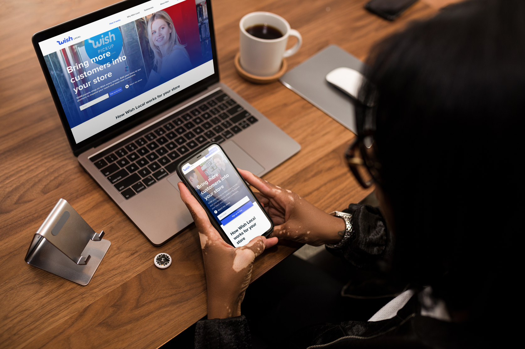
Pictured to the left is a photo of the first version of the Wish Local website. After further investigation, I found three factors that needed to change.
According to stats via Google, this version of the website has an 89% bounce off rate 😬
Over 90% of users are visiting the site from their mobile devices and the site itself isn’t optimized for the mobile experience 🤕
Doesn’t match the rebrand of Wish Local’s design system components and the Wish Local mobile app🥸
What will success
look like?
An increased percentage 📈 in merchant acquisition (store owners applying for the program), and a decreased percentage 📉 of applicant drop-off.
These words became a mantra to my day to day challenges of figuring out the right solution to get this outcome.

🧐Time to dig deeper🧐
Piecing things together
Competitive Research
What makes/breaks a good landing page?
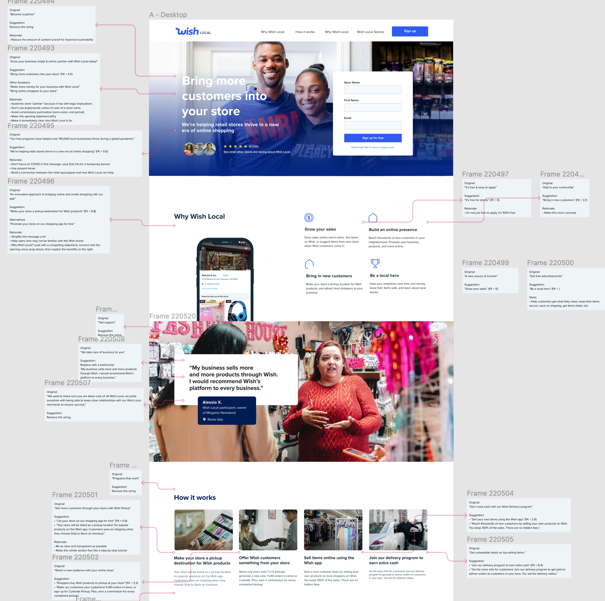
During my research, I found several insightful articles that explain what makes a good landing page and I worked collaboratively with my intern manager to compare landing pages from over 20+ companies, and synthesized specific elements of what we believed to make them successful. We then listed out repeated elements of the most appealing landing pages, and I took these into consideration when beginning to experiment with mid-fi iterations.

A glimpse of the competitive research collaboration on Figma
Elements of a scrollable-worthy landing page
Having a sticky header with the company’s logo and CTA
Having an intriguing headline that prompts the user to keep scrolling
Balance of photographs and illustrations/icons to convey meaning to programs
Some kind of social proof such as ratings, testimonials, etc.
A “why” statement that embodies the mission of the company
Descriptive hero image so that a user can get an introduction on what to expect from the programs
What design system components are we working with?
In addition to finding answers beyond Wish, I also had to find answers within the Wish ecosystem to figure out how the new Wish Local design system elements could be used to our advantage. This was very exciting because it was my first time ever using set components on Figma!


What were my design
constraints, if any?
Something that was important to me was to understand how far I could go with my design. As I was navigating the design system, I also questioned what assets we could begin to use. Recognizing that we were unable to designate a photoshoot/video for this project, I had to be resourceful and investigate to find assets that were already in the Wish ecosystem—and I did!
Sounds like things are going smoothly, right? Wrong.
I discovered a major blocker
(and did something about it)
My stakeholders’ priorities were misaligned
As I was preparing to understand what exactly I was going to revolve my content around my design, I knew that it was important to get buy-in from all my stakeholders (design managers, eng, business development, and localization). However, I found that my stakeholders had varying opinions on how to strategically market Wish Local, and I was stuck on what content should represent my designs.
So, in order to find a solution, I proactively went back to the drawing board and organized a live Miro collaboration workshop and follow-up where all we did was talk about prioritization of content. The outcome? I was able to realign 11+ stakeholders to agree to a single content strategy in order to move forward. This catapulted the process forward and gave clarity to not only my design decisions moving forward but also the UX Writer that I worked very closely with.
Workshop Takeaways
Here were some things that we cleared up
✍UX Writing✍
We decided to simplify the overall content design to create more clear merchant understanding
(example: instead of “increase store foot traffic,” use “bring in new customers to your store.”
🧩Organization🧩
We finalized the order of sections for the landing page to clarify what type of information I was designing for and why.
🖼Assets🖼
We agreed that the website would heavily rely on real Wish Local merchant images, and have some iconography to support value propositions.
🧪Testing Strategy🧪
We confirmed with our UX Researcher if our strategy of testing the landing page with the sign up flow would be enough to test its success.
The Problem Statement
How might we create an engaging, well-branded landing page experience that is informative, and persuasive to gain merchant acquisition in Wish Local?
With all that in mind, it was
Time to design!
Designing with a
“mobile-first” mindset.
It was my first time ever having to design a website with a mobile-first mindset, and it literally took me a few days to realize what that meant. I was wasting my time trying to be pixel-perfect with my mid-fi web iterations when in reality it was easier to iterate on the mobile site and then add it onto the desktop canvas. Once I got my brain going, I began exploration.
My first time working with a UX Writer
In addition to it being my first time working with a “mobile-first” mindset, it was also my first time collaborating in
real-time with a UX Writer. I learned a lot about figuring out how to create an organized and easily understandable design space on Figma, as well as contributing to content conversations and giving as well as receiving feedback from cross-functional partners!
The Hypothesis
If we used a balance of photographic assets & dynamic visuals paired with innovative elements that create a successful landing page (i.e. progressive disclosure), then users will feel more trusting of the program and will sign up.
Usability Testing Begins!
I had the pleasure of working with fellow design intern, Cian to prepare for our user research via UserTesting.com. We wanted to test both the landing page (my intern project) and the sign-up flow (his intern project).
Below are things to note
We worked together to write and revise a user research script document with the head of
UX ResearchWe ran a total of 5 live usability tests together, 2 of which I conducted
We synced to figure out what takeaways we found from each section of the user’s flow through the landing page and sign-up flow
What I was testing for
How the user organically scrolled through the landing page and observing their first reactions to the site
Qualitative data regarding user’s understanding, opinion, and relevance of the content once I provided questions to test for user comprehension of Wish Local’s programs
Learn more about how the user responds to our art direction

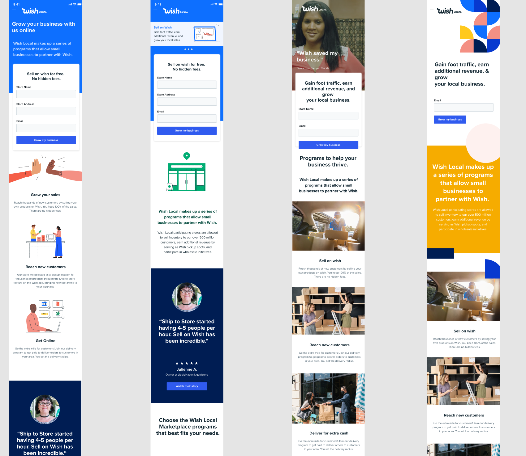
A preview of the prototype that we tested.
User Research Takeaways & Design Revisions
Given all of the qualitative data that Cian and I collected, I decided to review and implement the current design to match our own.

Before

After
More definitions, fewer testimonials
Actionable Takeaway
3/5 users ignored testimonials because they knew that they would be bias
Design Revision
We took away the entire testimonial section and significantly decreased scrolls
Less “selling,” more proactive answering
Actionable Takeaways
5 of 5 users wanted more information around why or how it’s free
3/5 users wanted to see a video overview of how the program works
2/5 felt the “Why Wish Local” section points were either too general or just reiterated what they already knew.
"This feels very general and I don't get a ton of utility out of it. I'd browse through it pretty fast."
“This could be text for any other platform.”
Design Revision
Take away the “Why Wish Local” section, and instead fill it with information that proactively answers the user’s questions about the overall program.

Before

After

Before

After
Implementing Progressive Disclosure
Actionable Takeaways
3/5 users didn’t even make it to the How it Works section on the first organic run, even though most users found it to be the most valuable section
Make value props more concrete, unique, distinct to Wish Local and maybe throw in more of how it works into this section or blend the 2 sections
3/5 users mentioned wanting to see hard numbers for the amount they could earn or for the increase in foot traffic they could get
Design Revisions
Focus on different ways to create a better information hierarchy and find creative ways to cover questions with progressive disclosure
Final Deliverables
Drumroll, please…
The Outcome
Here is the final prototype of the Wish Local Landing Page. Having our deadline 1 week right after user research was tough, but we did it!
I successfully completed V1 of the Wish Local Landing Page Redesign as the owner and Product Designer of the project.
Feedback
“Wanted to share some feedback we were getting on the landing pages +signup experience. It’s still early days but it’s looking positive (Quantative and Qualitative). Wanted to personally thank you for the amazing work you’ve done for us!”
“We’ve gotten a lot of positive feedback from users about the new Wish Local website. Awesome, awesome job on the designs!! ❤️”
Reflection
If I had more time…
I would have dived deeper into the other areas of improvement that were listed in our takeaways.
My biggest challenge was…
Maintaining drive and proactivity to engage and align all of my stakeholders. I had to get used to overcommunicating for the better!
My biggest takeaway was…
Cross-functional alignment is crucial for a successful project and successful product. The earlier you establish specific expectations and priorities, the easier the project is going to be.