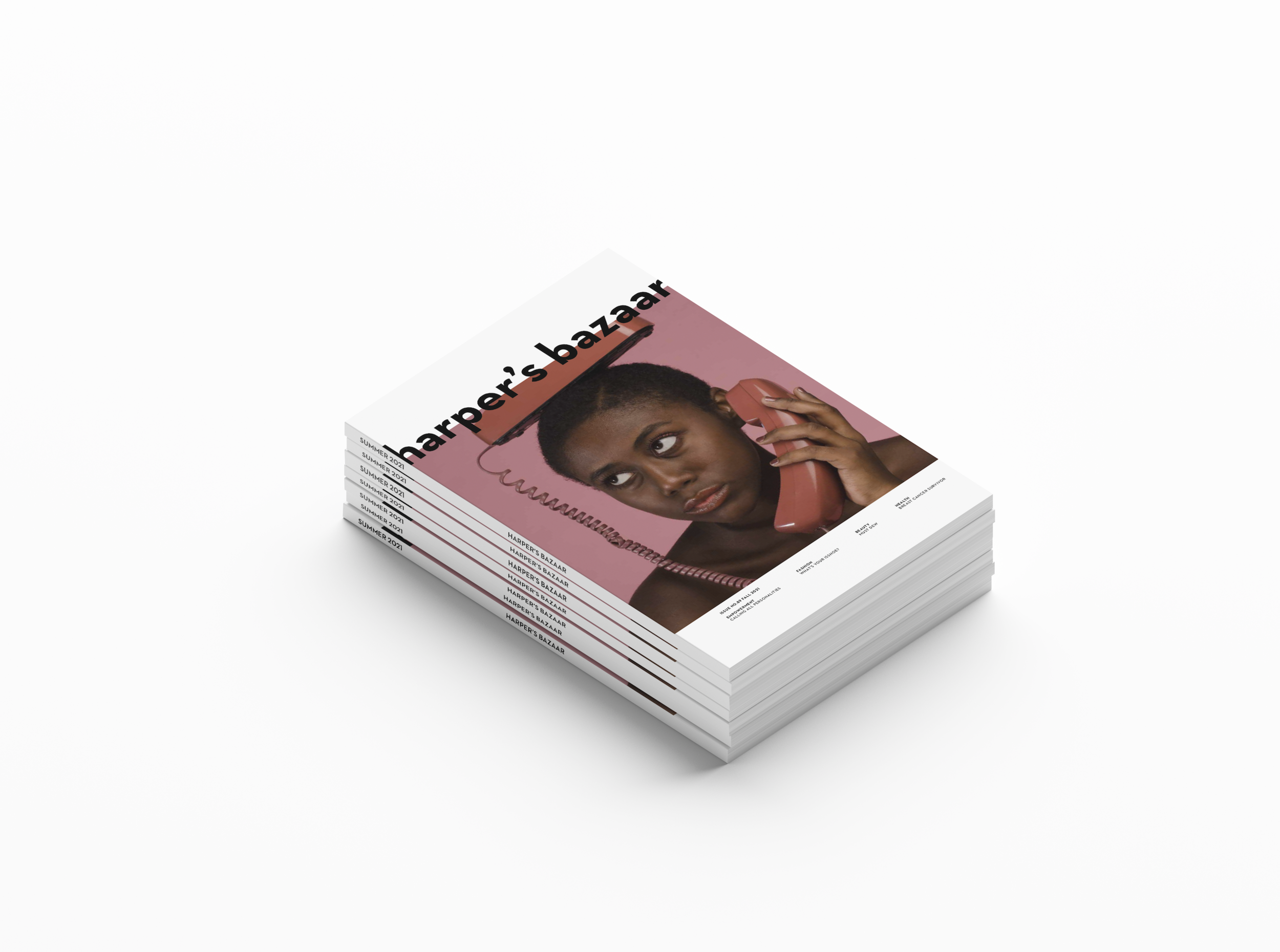
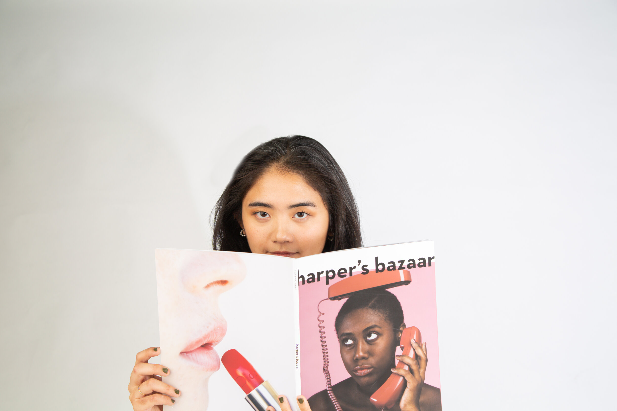
HARPER’S BAZAAR
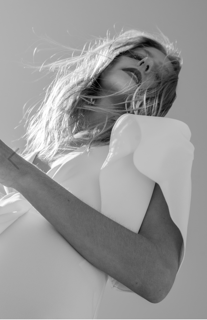
Challenging conventional beauty representation in publications through subversive design.
-
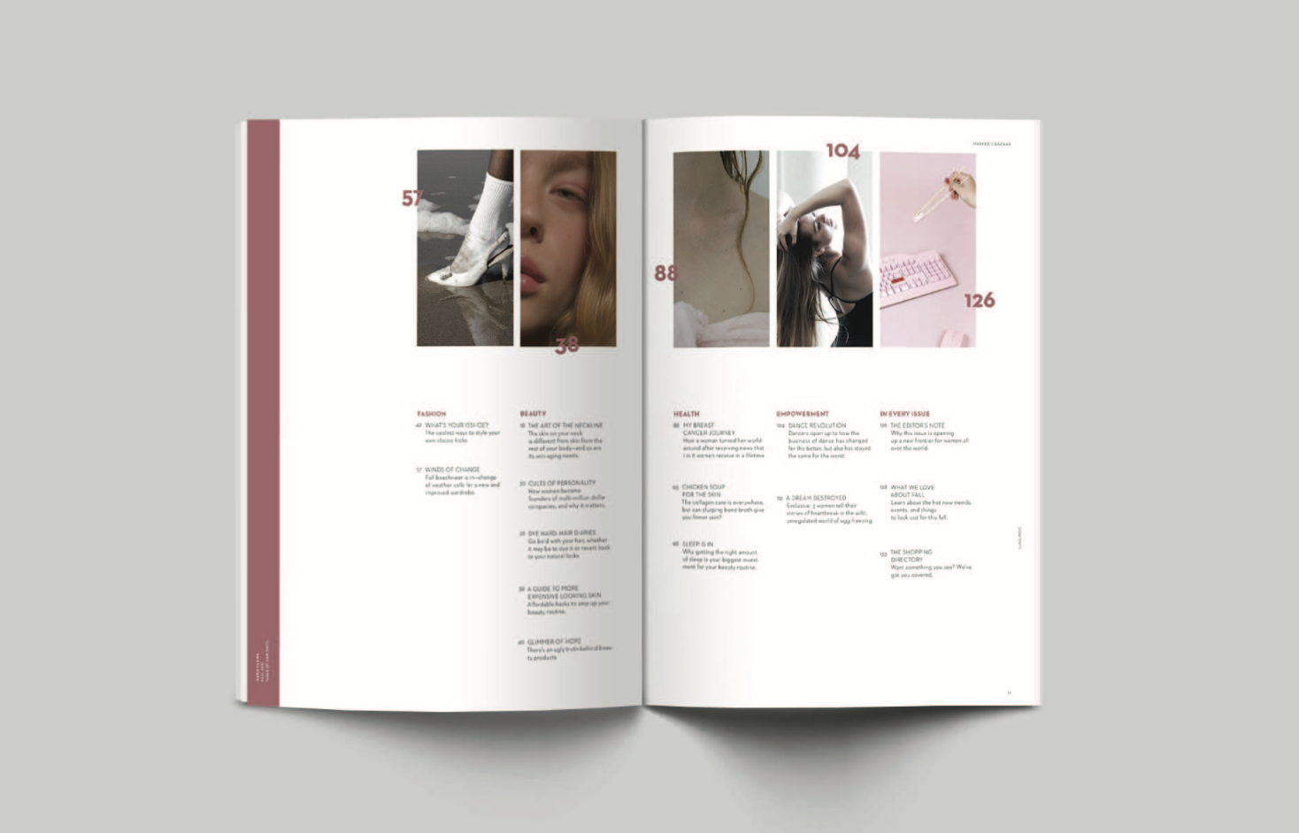
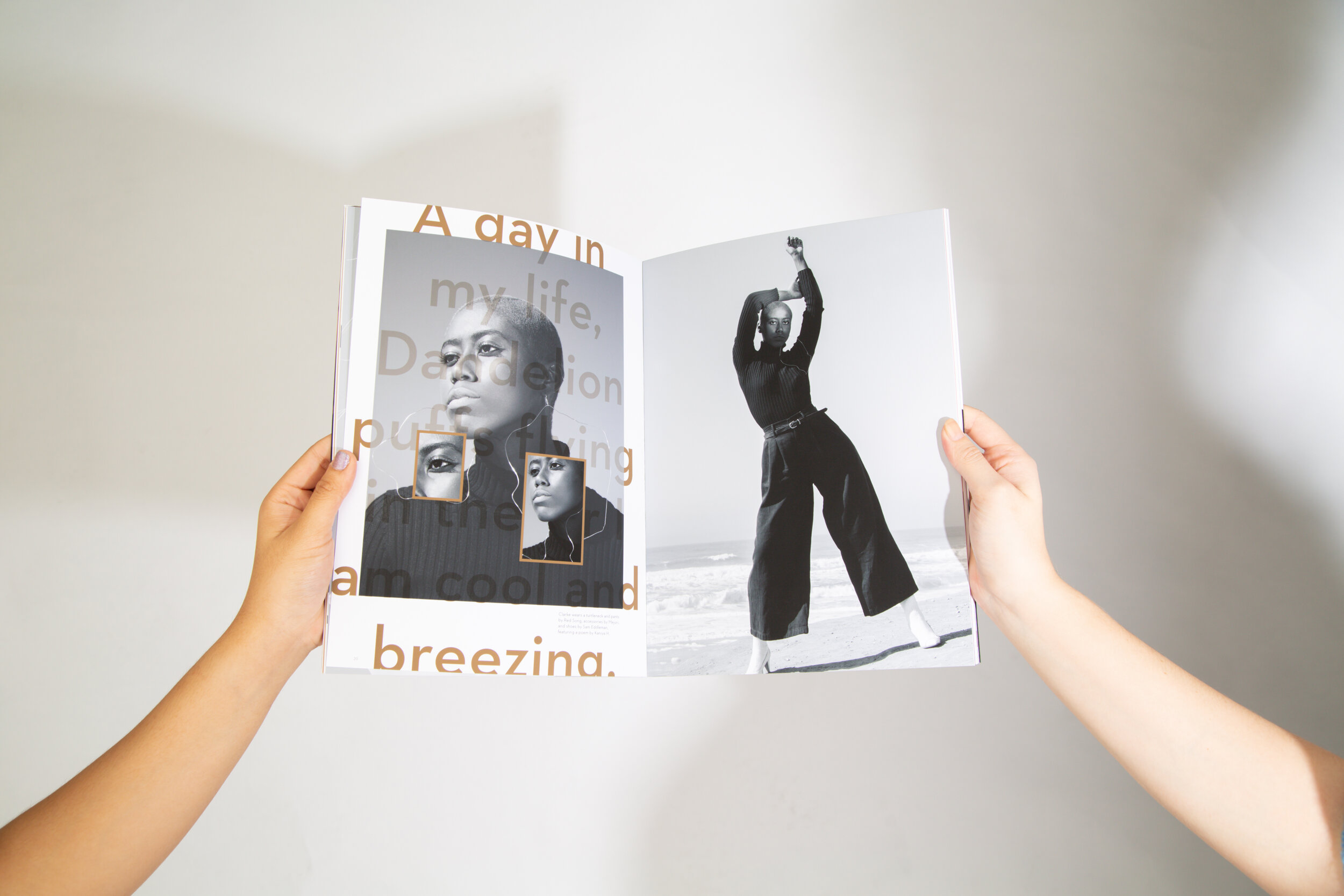
Redesign an existing magazine publication with a complete typographic system.
-
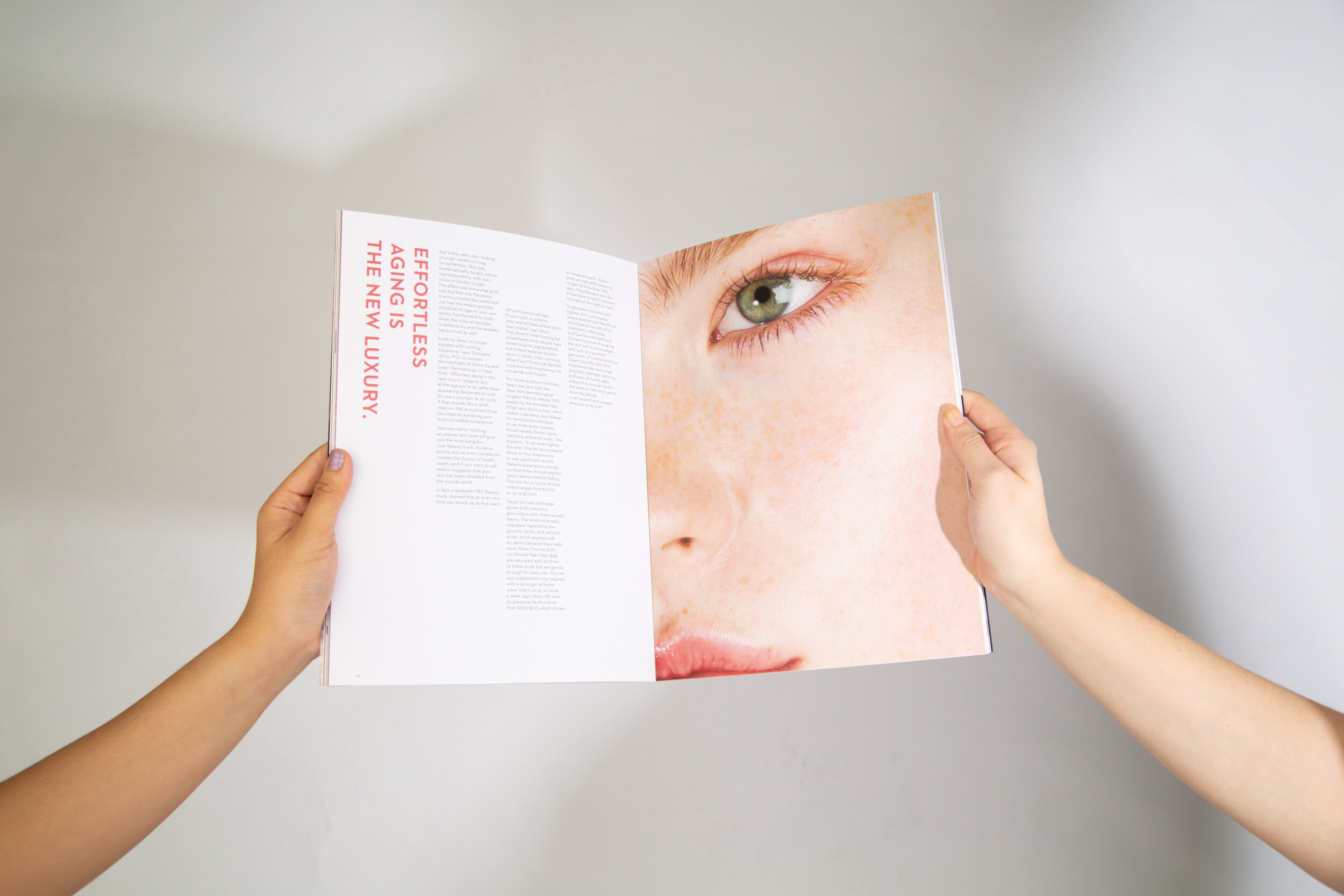
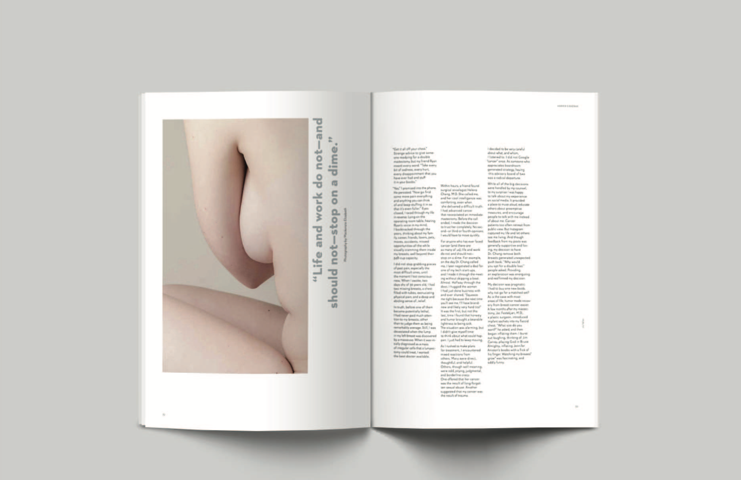
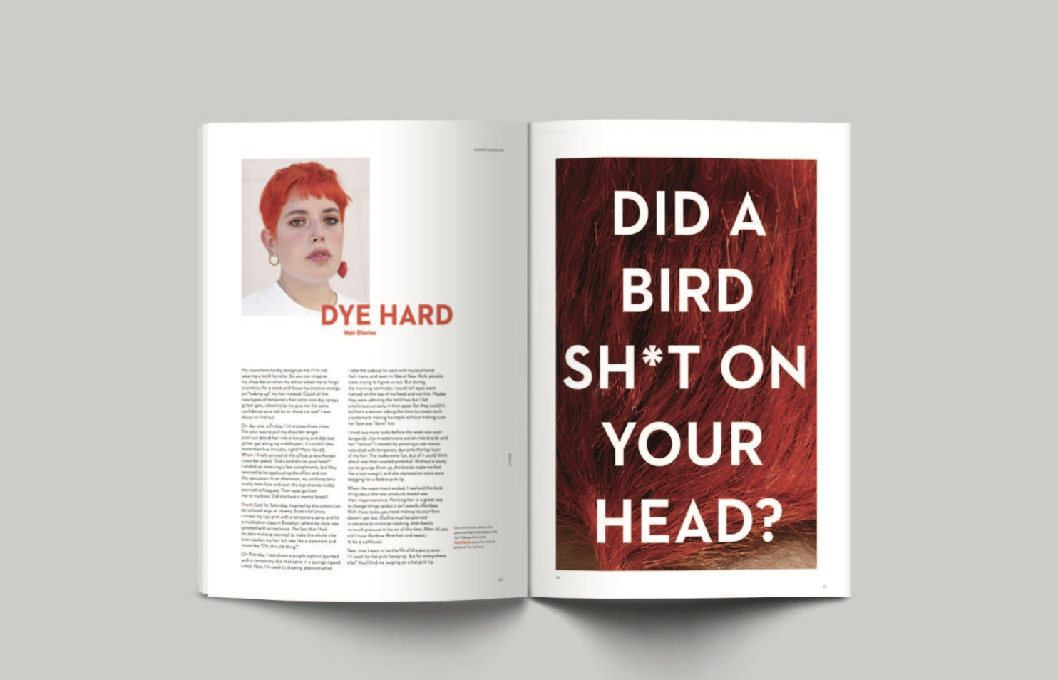
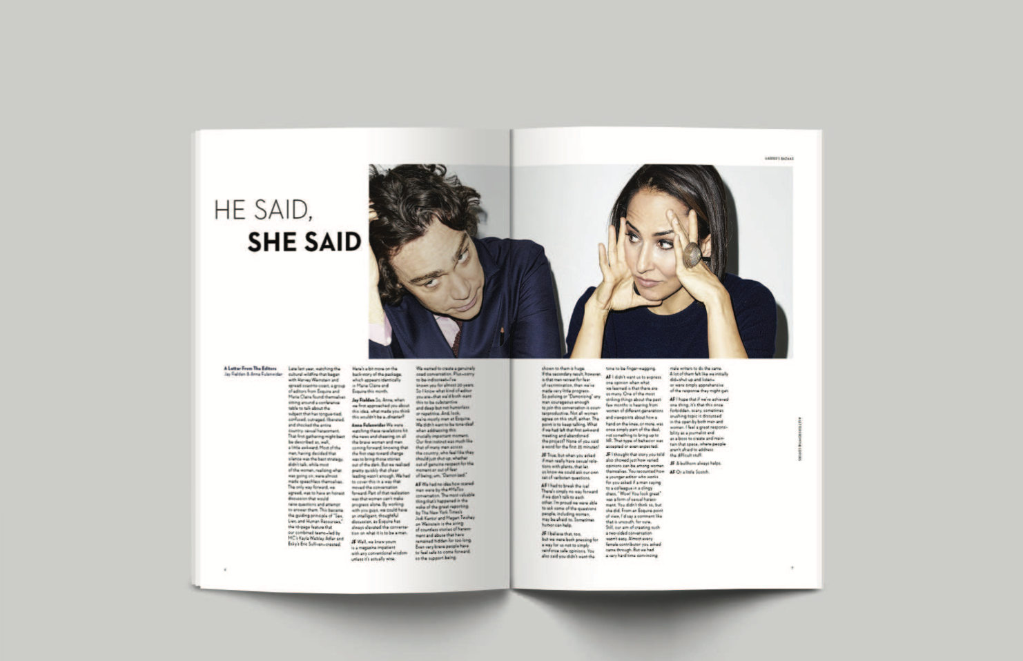
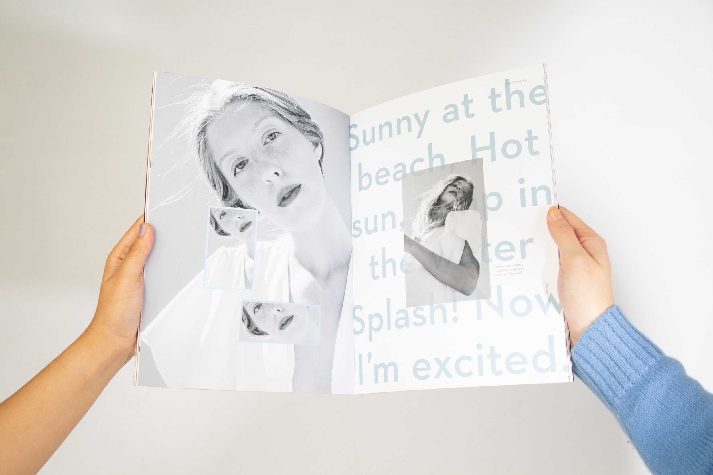
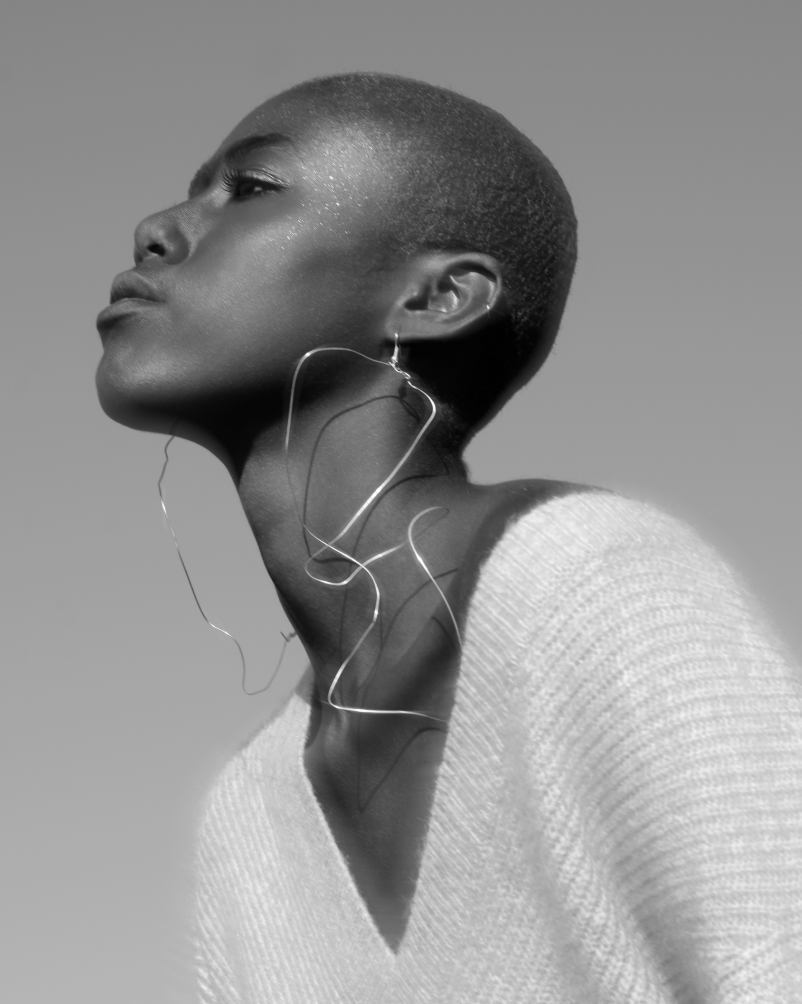
Pair bold and unconventional photography with bold and unconventional typographic choices in order to create an intriguing magazine that catches the eye of the target audience: Gen-Z. Choose images that are empowering and inclusive, while creating dynamic spreads with typographic motion and movement.
Reflection
In creating this magazine, I learned a lot about designing a publication's system. I was able to understand the importance of typographic studies, as well as the impact of hierarchy and scale when it came to designing my spreads. I also learned how empowering it can be to collaborate with other creators directly (as opposed to utilizing stock photography); although it was an unnecessary task, I thought it was what made my project stand out amongst the rest of my peers.
Key Takeaway
Collaboration between differing mediums of art/design makes an impactful and upstanding final product.